Showing posts with label Album Cover. Show all posts

Thursday, 24 February 2011

AUDIENCE FEEDBACK


We asked a group of 15-16 year olds the following questions; what do you like about the album covers and how could they be improved. We then showed them our individual sketches of the potential album cover we have designed for AbbieSinger and asked if they would be happy to buy our CD cover. The chosen covers relate to what we believe as a group through brainstorming and researching various Neo-Soul and Soul artists, AbbieSinger best markets within.  These covers consist of Amy Winehouse, Sade, Alicia Keys and Adele’s album covers.

 
Soul artist album covers’ are typically personal and use close up shots of the artists’ faces to tell a deep story. Often as the Amy Winehouse, Alicia Keys and Adele’’s album covers  show they have very little narration in the background but the emotions and intensity drawn on their faces tell a equally deep story . In contrast Sade’s album cover is very detail and does not use her facial expressions to put a story across, the power is held within her body positioning and countryside scenery. Personally I believe this cover is more powerful in bringing forward her soul genre as mystery lurks in the background and I prefer to make my AbbieSinger cover similar as I want my cover to have more depth and meaning through detail as oppose to simplicity. Although Simplicity works and it creates a more personal relationship between the artist and the consumer. Albums serve the purpose of delivering an extended musical experience to an individual there is a more intimate bond formed compared to the bond created through listening to music on the radio.  Perhaps this is because the consumer has actively chosen to buy music from one artist that incorporates a portfolio of their music and only their music, but audience research has also shown that the bold fonts, the clear embracing faces and simple use of colour is what separates Soul cover’s from other genre’s covers. Marcus a 16year old boy said he would buy Alicia Key’s album over the rest because she is a credible artist and her beauty shines out from the cover. He also suggested that I could improve my album cover by using more colour and making it vibrant so that it competes with the likes of Rihanna’s ‘loud’ album and today’s market.

Digipak


Drafts CDs


In order to receive quick and relevant criticisms on my album sketches, I used a questionnaire to ask a sample of 15-18 year olds, unisex group at my secondary school. I choose to include those who weren’t necessarily my target audience to enable a wide range of responses. In general the respondents liked the playful character that I had created in AbbieSinger’s album cover as it set the cover apart from the typically intense soulful covers like:   


They also felt that the use of a piano showed what type of artist AbbieSinger is straightaway and because her body is hidden by the instrument, AbbieSinger is not sexually objectified; this was an important question as I did not want my artist to gain success on the basis of her sexuality instead I felt it was important for the debut album to reflect my artist’s values and beliefs. The only criticism which my digipak received was the audiences questioning whether I could balance the bright colours with the classical genre that is neo-soul. They advised me not to overpower the monotone colours with the bright, flamboyant colours, either choose to make the album cover very colourful or keep it simple.  
(Click to enlarge)


(Click to enlarge)

Improvements required from Pavan Bansal: use a more professional font, add two colours to the writing, move the title 'AbbieSinger' from the right hand side to the left and make sure both titles are bold as it’s the first thing everyone sees. “The Awakening” page make the writing centred, using more of a professional font and use a wash-out picture in the background, perhaps guitar strings. The top two pictures make the background black and white with AbbieSinger shining in colour to make her stand out more and show a journey transformation from the past to the present.


(Click to enlarge)


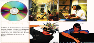
Front Cover: Abbiesinger is leaning on the Piano; I deliberately used a picture with her face and a piano to represent her love for music and her talent. As I’ve previously mentioned, AbbieSinger is a talented musician who is trained in both the Guitar and the Piano. She enjoys writing music as well as singing it and she is a dedicated rising star. I feel that my front cover has an animated quality that portrays my artist’s playful side as well as her passion for writing music and singing it.
Back cover: The use of a mask to hide AbbieSinger’s face juxtaposes nicely with the front cover, this symbolises her double personality. On the one hand, she is the typical neo-soul artist; she hits the high notes well and embodies, soul music with RnB undertones. But on the other hand she is a young, fresh neo-soul artist who brings her youthful soul to the genre. I enjoyed using Photoshop to edit this particular photo as I was allowed to play with the contrast of the blacks and whites as well as brightening the peacock feathers making it stand out.
Guitar Cover: this page would feature inside the Digipak, it shows AbbieSinger playing at a gig in the Jazz Cafe London, and this is what as an artist she enjoys most; playing to an enthusiastic crowd that appreciate neo-soul. Quoting my artist “my guitar is my best friend” AbbieSinger primarily enjoys assisting her vocals with her guitar as it balances out her soulful voice. As a result, I felt it was most appropriate to place her second love in her debut Digipak (almost like a diary to my artist) and the use of a black background and a colour foreground only highlights my artist and her passion more.
My Overall opinion: Considering all pages together as a finished product, I think it achieves my goal of promoting my artist as well as sharing her values and beliefs to the consumers. Fans of AbbieSinger are immediately aware of her passion for the piano and the guitar, as well as her feisty/ playful personality. All this is achieved through the visual images in her Digipak. Most importantly, we can see the various stages of thought processes and adjustments I had undergone in order to improve my first draft and this continue to go on for my music video and homepage.

Inspiration


This album cover is what AbbieSinger’s cover is most inspired by, the text is placed in the right hand corner and Rhianna’s eyes and lips are the main focus of the cover as it invites the consumer to explore her world, probing them to buy her album. I also like the ‘negative’ effect used as it makes the album cover stand out because it is something different and unusual. This has inspired me to incorporate an effect to boost AbbieSinger’s playful side and also make my piece more artistically engaging. The only difference is I would like my album cover to be colourful as the previous colour scheme shows. 

The Colour Scheme

Here is a visual representation of how I envision my final album cover to look like. I want the cover to be vibrant and playful with a mixture of bright colours to catch the consumer’s eye ahead of other album covers. I also think it is very important to keep up with what is 'trendy' at the moment and with the likes of Rihanna and Lady Gaga the dominating force of mainstream music videos, it seems as though the brightest colours are more infectious as oppose to the typical safe colours such as warm whites and brown. Through the eyes of a consumer, album covers that are extravagant and stand out amongst the crowd in a HMV store are the ones with the brightest, engaging colours and shocking poses by the artist.


Album Cover Ideas


Possible effects to use:

The use of effects will vary on the finished Album cover; this is so that the final product has a polished and professional look with the aid of touch up on photoshop and other effects websites such as: